
“Color can make designs more visually interesting and aesthetic, and can reinforce the organization and meaning of elements in a design. If used improperly, colors can seriously harm the form and function of a design.”
Color is used widely in surgical checklists, but not always wisely.
Follow three simple rules
1. Add color only when it serves a specific purpose
to distinguish one checklist from another
to visually link one checklist with another
to identify the role that needs to perform certain actions
to identify different sections of the checklist (i.e., before anesthesia, before incision, after closing)
2. Use each color with rigid consistency
Once a color has been assigned one meaning on your checklist (e.g., green indicates actions a Nurse takes), that color should not be used in any other context.
When a color is used in other checklists or instructions that will appear in the same location or will be used by the same people, avoid using that color to mean something different (e.g., if red means ‘stop’ on a general surgical checklist, it should not be used to identify ‘Surgeon actions’ on a specialty checklist in the same operating rooms).
3. Be mindful of contrast
Black text on a white page provides maximum contrast, making it easiest to read. Colored text, and black text on a colored background, will always have less contrast.
Use dark colors for text (black text is best on white or lightly colored areas)
Use light colors for background areas that contain text
Use white text when putting text on dark areas of color (say to identify different sections)
Darkly shaded areas on a white page tend to grab a viewer’s attention. They also create visual tension (e.g., they can feel distracting or ‘noisy’ on the page).
Avoid creating areas of high contrast that do not direct the viewer’s attention to something meaningful
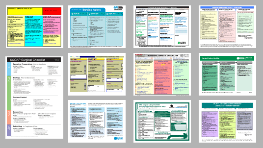
Examples
Using color to identify sections
In figure 1, two checklists use color effectively to distinguish a discrete series of steps that are performed at different times.

Figure 1: Using color to identify sections.
The SCOAP Surgical Checklist (left) uses color only in the margins so that the text within each section has maximum contrast. In the sample on the right, color is used behind the text throughout each section.
Using colored text on a colored background
Colored text on a colored background is usually more difficult to read. Figure 2 illustrates this point. Not only is there no apparent reason for the use of colored text, the choice of colors makes reading extremely difficult.

Figure 2: These samples, taken from two actual surgical checklists, shows how poor color choice makes text difficult to read.
In Figure 3, blue headings and black instructions are used on a lightly colored background. The headings are bold, which replaces some of the contrast lost by using blue rather than black text. Note that the headings stand out less well in the blue section on the right.

Figure 3: Consistent blue headings and black text on lightly colored background.
Using color for branding
Figure 4 shows two surgical checklists that appear to have been created by graphic designers. (They both have elements that are complicated for the average user to create.) In both checklists, color appears to be selected and/or used based on institutional branding. In theory, this is a fine idea. In practice, the color use takes attention away from the content.
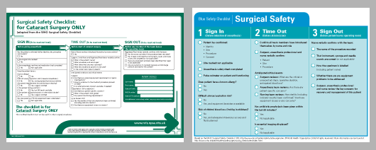
Figure 4: These checklists are aesthetically pleasing and match institutional branding, but perhaps at the expense of focusing on the content.
The example on the left contains a large arrow (also used on other checklists within this organization) and a heavy border, both in the same dark color used to identify the sections of the checklist procedure. The arrow captures a lot of a viewer's attention, but why? When are we supposed to follow it? Where does it go?
On the right, the overall design is clean and clear, but by using a blue color under the three sections of the checklist, the designer has made the actual steps more difficult to read.
In Figure 5, a designer takes a different approach, using minimal color (taken from the institution logo) to clearly highlight key information without getting in the way of the content.

Figure 5: The institution's brand color is used only minimally, highlighting just key information
References
Lidwell, William, Kritina Holden, and Jill Butler. Universal Principles of Design. Rockport Publishers, 2003.
Davies, J.M., et al. (2009) Surgical Safety Checklist: A Redesign Using Human Factors Guidelines. University of Calgary.
UK Civil Aviation Authority. (2006). Guidance on the Design, Presentation and Use of Emergency and Abnormal Checklists.
Verdaasdonk, E.G.G., et al. (2008). Requirements for the design and implementation of checklists for surgical processes.
Ross, P. (2004). Human Factors Issues of the Aircraft Checklist. Journal of Aviation/Aerospace Education and Research.